I wrote about this topic recently for a class of mine, and I thought I would share this topic here, since it’s an issue that have interested demographers and other social scientists for a long time.
Introduction and Significance of the Study:
It has been frequently observed that women around the world today have vastly different fertility rates. Last year, a news article from CBS news suggests that the dropping birthrates, especially in developed nations, is threatening global economic growth rate.(CBS) This is indeed a worrisome issue for policy-makers, from Germany to Japan. At the same time, we note that these developed nations are also among the most densely populated regions in the world, suggesting that these nations in the past have had high population growth rates, but subsequently slowed their birth rates. At the same time, many nations in Sub-Saharan Africa have relatively low density populations and abundant agriculturally productive land (Kenya, Tanzania), yet are economically underdeveloped. In class, we spoke about the “demographic transition”, i.e. each of these countries are in a different stage of this transition from high to low birth rates (Goldstein). However, given the observation that many nations that have low birthrate already have a high population concentration, we wondered if population density in fact affects the number of children a woman will have and if other underlying factors – such as governmental actions, social norms (especially for women), and levels of economic development – will affect the number of children a women have over the course of her lifetime.
Hypothesis: Regions with high population density would have lower fertility rates; this is due to economic development over time, the role of women in society and government policies.
In this study, we looked at 3 broad geographic regions: East Asia & Pacific, Middle East & North Africa, Sub-Saharan Africa and compared their developments over time. These 3 regions were used since the cultural practices, economic fortunes, and governmental influences were vastly different and provides a good cross-sectional study for analyzing the changes in global fertility rates. We will determine if the changes in fertility rates in these three regions are indeed negatively correlated with population density and other underlying factors such as economic development, women’s employment and other factors such as the availability of contraception.
2) Data Extraction and Methods:
All data for this study came from the World Bank Data, from 2012 and 2013 depending on its availability. We utilized all available data the following variables to complete the study:
- Total fertility rates: the average number of children that a woman is expected to have over the course of her lifetime (for 1960-2013)
- Overall population density: total population of the country divided by its total land, in people/km^2 (for 1960-2013)
- GDP Per Capita. The Gross Domestic Product (GDP), a measure of total national economic output, divided by the country’s population for a given year (for 1960-2013)
- Female labor force participation rate: percentage of women active in the labor force, aged 15 or older. (for 1990-2012)
- Contraception prevalence: the percentage of women (or her partner) who were practicing any form of contraception; for women ages 15-49. Data available only for 1990, 2000, and 2010.
In this study, we used several different prospective factors that may affect the overall population density and were associated with changes in fertility rates for women: GDP per capita, female labor force participation and contraception usage. The three regions were chosen based on their differences in changes in Total Fertility Rates, such as timing and speed of decline, in order to study what could have contribute to this different variations in their respective patterns of decline. The observed period of time was selected as the maximum number of years for which data was available to ensure that whatever correlation we observed was not do to random variations within the data set. In addition, a separate study was done for China to measure a special case of the effect of government policies on the decline in birthrates.
For the sources of data, our date ranges are from 1960 to 2013 for fertility rates, overall population density, and GDP per capita; and ranged from 1990 to 2013 for female labor participation and contraception usage. We use the largest date range available for each variable in order to more accurately determine the long-term trends for each variable.
Methodology: We decided to analyze the data by presenting the relationship between the variables in a graphical format. For readability, we divided the variables into two sets of 3 graphs each, with each graph representing a separate region. The first set of graphs presented fertility, population density and GDP per capita in each of the graphs. For the next set of 3 graphs, we presented fertility rates with women’s labor force participation and access to contraceptives. Then we calculated the correlations between the fertility rates with each of the other variables to give a more definite, mathematical result. The final graph measured specifically China’s decline in birthrate and increasing per capita income.
3) Presentation of Results:
Graphs 1-3 records data for the three regions from 1963 -2013. It measured the changes through time of fertility rates, population density and economic output. Graph 1 depicted Middle East/North African fertility, GDP per capita and population density trends over time. There were several trends common to all. First, there was a very strong negative correlation between the fertility and population density/GDP per capita in all three regions measured (a correlation between -0.8 and -0.98). Second, population density had been steadily increasing for East Asia & Pacific and Middle East, while the Sub-Saharan African density had been increasing much more dramatically. Thirdly, the most rapid phase of GDP per capita increase occurred in all regions after 2000.
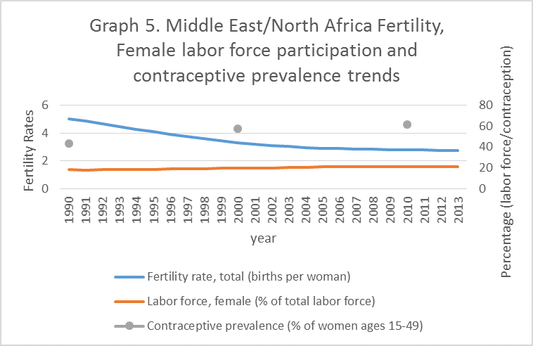
For Graph 1, we saw that the fertility rate for the Middle East steadily decreased from 1960 to 1985 (6.87 to 5.88) and then had a steeper decline from 1985 to 2000 (5.88 to 3.04), and finally the decline in fertility stabilized at around 2.75. Meanwhile, the population density increased dramatically from around 10 people per square kilometer to around 36 people per square kilometer, increasing roughly linearly. Therefore, there was a strong negative correlation between population density and fertility decline in this region. Meanwhile, per capita income in the region has also increased, most significantly from 1973 to 1980 and from 2000 onward. Graphs 2 and 3 told a similar story. East Asian &Pacific fertility declined drastically from late 1960s, from 5.5 children per woman in 1968 to 1.85 per woman in 1998; economically, the region’s per capita income steadily increased until 1995, and then stagnated from 1995 until around 2002, before starting to increase drastically once again. For Sub-Saharan Africa, the decline in fertility occurred much later, starting around 1987, and had been declining at a slower pace than for the other two regions discussed. Likewise, sustained per capita increases only occurred starting around 2001.
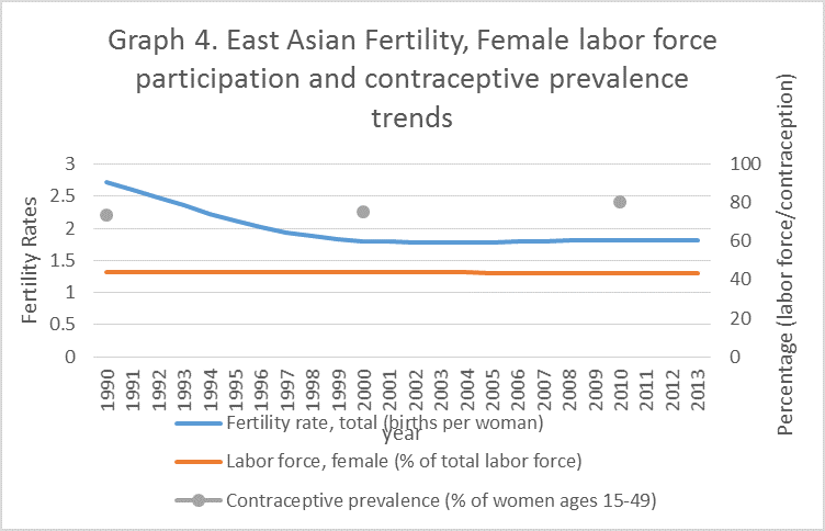
Graphs 4-6 records data for the three regions from 1990 -2010. It measured the changes through time of fertility rates, percentage of women in the labor force and the prevalence of contraceptives. All three regions witnessed the increased use of contraception: East Asia increased from 73% using contraception to 80% usage rates; Sub-Saharan Africa from 15 to 25%. Graph 4 depicted this increase in the East Asia/Pacific region and showed a roughly steady participation by women in the labor force. Aside from East Asia, there existed strong correlation between labor force participation by women and declining birth rates (-0.95 for both Middle East and Sub-Saharan Africa). Finally, a separate graph (Graph 7) was drawn for China by plotting its decline in fertility rates over time for the purposes of examining the effect of public policy on fertility. We see that fertility rates in China declined drastically from 6.3 in 1965 to 2.71 in 1980. Declining further until 1998, and it has held steady at 1.6 since then.
4). Conclusion
This paper studied the relationship between fertility rates and population density and prospective underlying causes for changing population densities. We found that there was a clear negative correlation between declining fertility rates and each of the individual factors measured: GDP per capita, female labor force participation and the prevalence of contraceptives. However, we cannot isolate any of these individual factors and point to it as a cause for declining fertility rates. Each of these factors are not mutually exclusive and acted to reinforce one another as well. For instance, increasing GDP per capita can increase contraceptive use since more women now could afford these new products; or along the lines of Boserup, increasing population could lead to greater density and more innovations and technological changes, which in turn increases income and decreasing the fertility rates. (Boserup) And it is possible that the variables examined are the result rather than the cause of fertility decline (i.e. a demographic “dividend” from having less child dependency) (Factsheet). The causes of fertility decline were complex and this paper only sought to examine a small amount of variables that can affect it.
The effect of family planning and government measures were more open to debate. For example, in China, we saw that fertility rates has already fallen to 3 by 1980, the year the so called “one-child policy” was implemented (Moore). Thereafter, the fertility rates steadily decreased, but based on comparisons with East Asia as a whole, it appeared that this fertility decline would have taken place even without the said policy. What appeared to be more significant in causing fertility decline remained the other factors discussed, such as increasing economic performances and contraception usages.
Limitations of the study:1. Exclusion of certain countries and regions from the study. There are incomplete information (missing fertility rates etc.) for certain country’s data. Therefore, these countries are not included in the regional averages. Some of the countries excluded have very high population density and relatively high birthrates (ex. some Pacific Island states) which are both factors we are attempting to draw conclusions from in this paper. This exclusion could result in errors that can affect our conclusions based on the graph and these data, once included, may result in slightly altered correlations and possible interpretations.
- Numerous other factors that may affect population density and fertility rates. There are other underlying factors that can cause a decline in fertility rates other than the economic development, women’s participation in the economy or government policy. Even though fertility rates negatively correlates between each of these factors, we cannot conclusively state that fertility rates rate is caused by these factors. Other factors that may be impactful include women’s educational attainment, and increasing quality and quantity of public health services. More studies need to be done how the effects of some of these other factors may directly impact fertility rates.
- The factors that contribute to fertility decline are not fully independent of one another. For example, the increased distribution of contraceptives may be the result of increasing economic output as measured by increases in GDP per capita, which enabled women to purchase contraceptives in the first place. The variables measured in this study can and do influence each other. Therefore, the conclusion drawn (that a negative correlation exists between fertility rates and all the other variables), may be an oversimplification.
Appendix:


Works Cited
Boserup, Ester. “Population and Technology in Preindustrial Europe.” Population and Development Review 13.4 (1987): 691-701. JSTOR. Web. 01 Apr. 2015.
“Contraceptive Prevalence (% of Women Ages 15-49).” World Bank, n.d. Web. 01 Apr. 2015. <http://data.worldbank.org/indicator/SP.DYN.CONU.ZS>.
“Dropping Birth Rates Threaten Global Economic Growth.” CBSNews. CBS Interactive, 7 May 2014. Web. 01 Apr. 2015.
“Fact Sheet: Attaining the Demographic Dividend.” Fact Sheet: Attaining the Demographic Dividend. Population Reference Bureau, n.d. Web. 01 Apr. 2015.
“Fertility Rate, Total (births per Woman).” World Bank, n.d. Web. 03 Apr. 2015. <http://data.worldbank.org/indicator/SP.DYN.TFRT.IN>.
“GDP per Capita (current US$).” World Bank, n.d. Web. 01 Apr. 2015. <http://data.worldbank.org/indicator/NY.GDP.PCAP.CD>.
“Labor Force, Female (% of Total Labor Force).” World Bank, n.d. Web. 01 Apr. 2015. <http://data.worldbank.org/indicator/SL.TLF.TOTL.FE.ZS>.
Moore, Malcolm. “What Is China’s One-child Policy?” The Telegraph. Telegraph Media Group, 30 Oct. 2014. Web. 01 Apr. 2015.